A Flurry of Facets

When I announced the last release of ggforce I hinted that I would like to transition to a more piecemeal release habit and avoid those monster releases that the last one was. True to my word, I am now thrilled to announce that a new version of ggforce is available on CRAN for your general consumption. It goes without saying that this release contains fewer features and fixes than the last one, but those it packs are considerable so let’s get to it.
Build for gganimate
The gganimate package facilitates the creation of animations from ggplot2 plots. It is build to be as general purpose as possible, but it still makes a few assumptions about how the layers in the plot behaves. Some of these assumptions where not met in a few of the ggforce geoms (the technical explanation was that some stats and geoms stripped group information from the data which trips up gganimate). This has been rectified in the new version of ggforce and all geoms should now be ready for use with gganimate (please report back if you run into any problems).
Facets for the people
The remainder of the release centers around facets and a few geoms that has been made specifically for them.
Enter the matrix
The biggest news is undoubtedly the introduction of facet_matrix(), a facet that allows you to create a grid of panels with different data columns in the different rows and columns of the grid. Examples of such arrangements are known as scatterplot matrices and pairs plots, but these are just a subset of the general approach.
Before we go on I will, in the interest of full disclosure, mention that certain types of scatterplot matrices have been possible for a long time. Most powerful has perhaps been the ggpairs() function in GGally that provides an API for pairs plots build on top of ggplot2. More low-level and limited has been the possibility of converting the data to a long format by stacking the columns of interest and using facet_grid(). The latter approach requires that all columns of interest are of the same type and further moves a crucial operation of the visualization out of the visualization API. The former approach, while powerful, is a wrapper around ggplot2 rather than an extension of the API. This means that you are limited to what the wrapper function provides thus loosing the flexibility of the ggplot2 API. A plurality of choices is good though, and I’m certain that there are rooms for all approaches to thrive.
To show off facet_matrix() I’ll start with a standard use of scatterplot matrices, namely plotting multiple components from a PCA analysis against each other.
library(recipes)
# Data described here: https://bookdown.org/max/FES/chicago-intro.html
load(url("https://github.com/topepo/FES/blob/master/Data_Sets/Chicago_trains/chicago.RData?raw=true"))

pca_on_stations <-
  recipe(~ ., data = training %>% select(starts_with("l14_"))) %>%
  step_center(all_predictors()) %>%
  step_scale(all_predictors()) %>%
  step_pca(all_predictors(), num_comp = 5) %>%
  prep() %>%
  juice()

pca_on_stations
## # A tibble: 5,698 x 5
## PC1 PC2 PC3 PC4 PC5
## <dbl> <dbl> <dbl> <dbl> <dbl>
## 1 1.37 4.41 0.347 0.150 0.631
## 2 1.86 4.50 0.618 0.161 0.523
## 3 2.03 4.50 0.569 0.0468 0.543
## 4 2.37 4.43 0.498 -0.209 0.559
## 5 2.37 4.13 0.422 -0.745 0.482
## 6 -15.7 1.23 0.0164 -0.180 1.04
## 7 -21.2 0.771 -0.653 1.35 1.23
## 8 -8.45 2.36 1.07 -0.143 0.404
## 9 3.04 4.30 0.555 -0.0476 0.548
## 10 2.98 4.45 0.409 -0.125 0.677
## # … with 5,688 more rowslibrary(ggforce)
ggplot(pca_on_stations, aes(x = .panel_x, y = .panel_y)) +
geom_point(alpha = 0.2, shape = 16, size = 0.5) +
facet_matrix(vars(everything()))
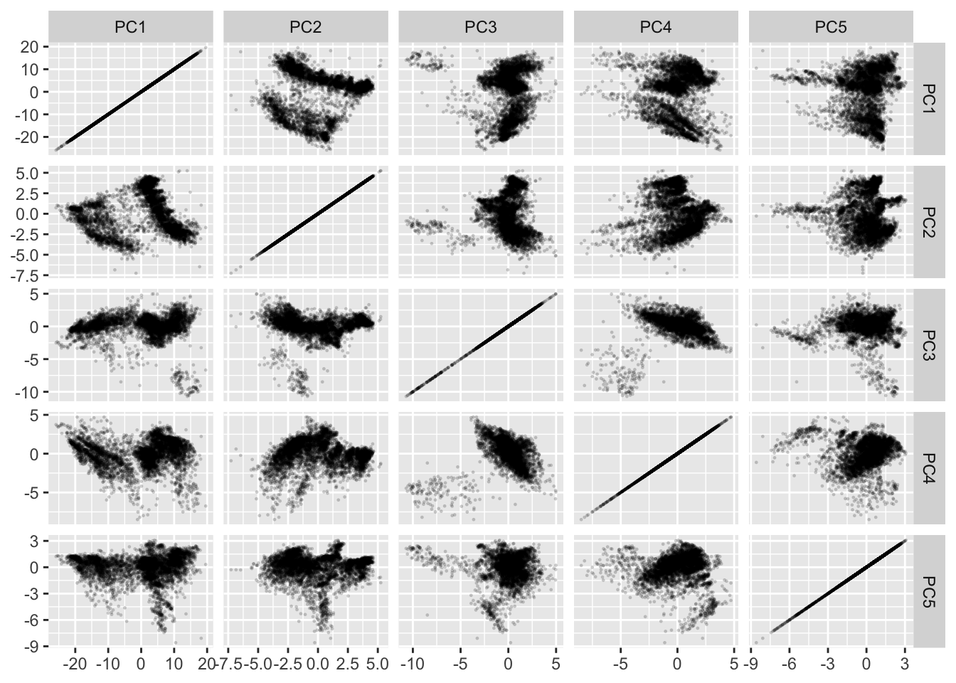
Let’s walk through that last piece of code. We construct a standard ggplot using geom_point() but we map x and y to .panel_x and .panel_y. These are placeholders created by facet_matrix(). Lastly we add the facet_matrix() specification. At a minimum we’ll need to specify which columns to use. For that we can use standard tidyselect syntax as known from e.g. dplyr::select() (here we use everything() to select all columns).
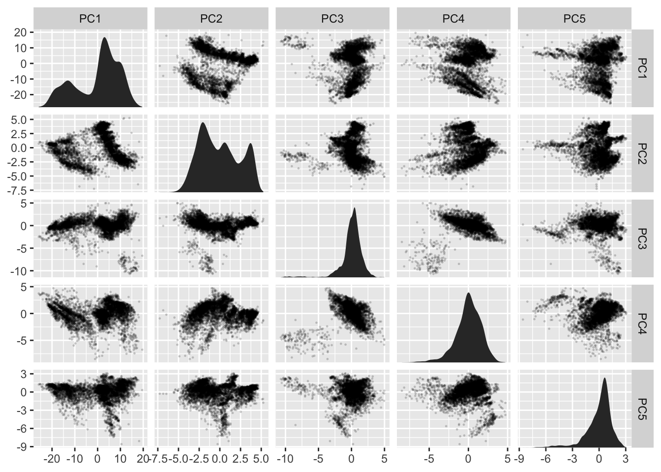
Now, the above plot has some obvious shortcomings. The diagonal is pretty useless for starters, and it is often that these panels are used to plot the distributions of the individual variables. Using e.g. geom_density() won’t work as it always start at 0, thus messing with the y-scale of each row. ggforce provides two new geoms tailored for the diagonal: geom_autodensity() and geom_autohistogram() which automatically positions itself inside the panel without affecting the y-scale. We’d still need to have this geom only in the diagonal, but facet_matrix() provides exactly this sort of control:
ggplot(pca_on_stations, aes(x = .panel_x, y = .panel_y)) +
  geom_point(alpha = 0.2, shape = 16, size = 0.5) +
  geom_autodensity() +
  facet_matrix(vars(everything()), layer.diag = 2)
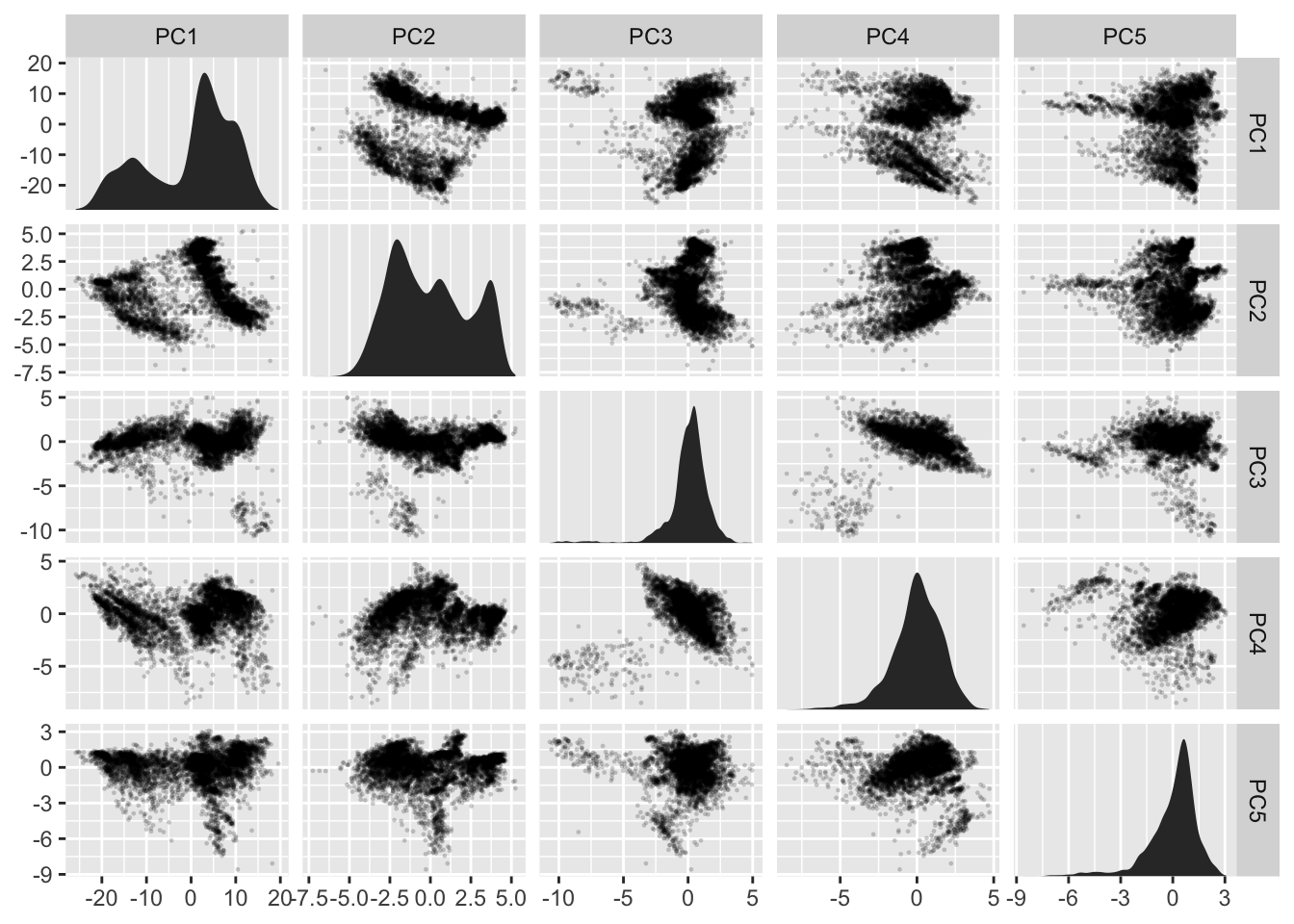
As the y-scale no longer affects the diagonal we’ll emphasize this by removing the horizontal grid lines there:
ggplot(pca_on_stations, aes(x = .panel_x, y = .panel_y)) +
  geom_point(alpha = 0.2, shape = 16, size = 0.5) +
  geom_autodensity() +
  facet_matrix(vars(everything()), layer.diag = 2, grid.y.diag = FALSE)
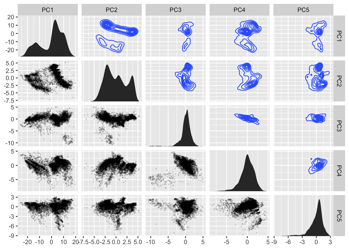
There is still some redundancy left. As the grid is symmetrical the upper and lower triangle shows basically the same (with flipped axes). We could add some insight by using another geom in one of the areas that showed some summary statistic instead:
ggplot(pca_on_stations, aes(x = .panel_x, y = .panel_y)) +
  geom_point(alpha = 0.2, shape = 16, size = 0.5) +
  geom_autodensity() +
  geom_density2d() +
  facet_matrix(vars(everything()), layer.diag = 2, layer.upper = 3,
               grid.y.diag = FALSE)
While we could call this a day and be pretty pleased with ourselves, I’ll need to show the final party trick of facet_matrix(). The above example was kind of easy because all the variables were continuous. What if we had a mix?
ggplot(mpg, aes(x = .panel_x, y = .panel_y)) +
  geom_point(shape = 16, size = 0.5) +
  facet_matrix(vars(fl, displ, hwy))
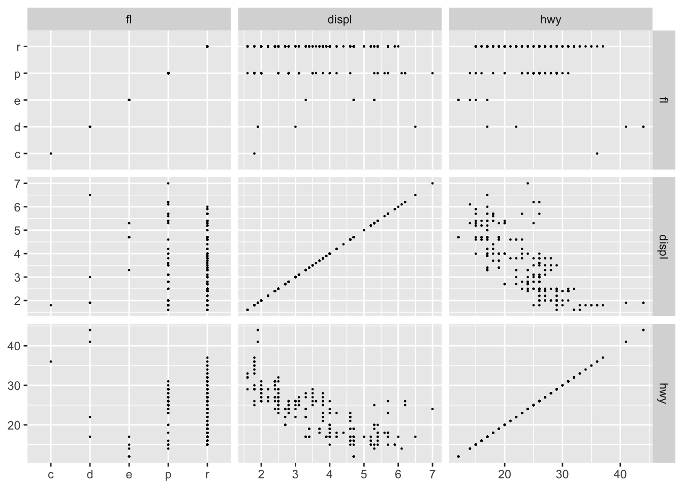
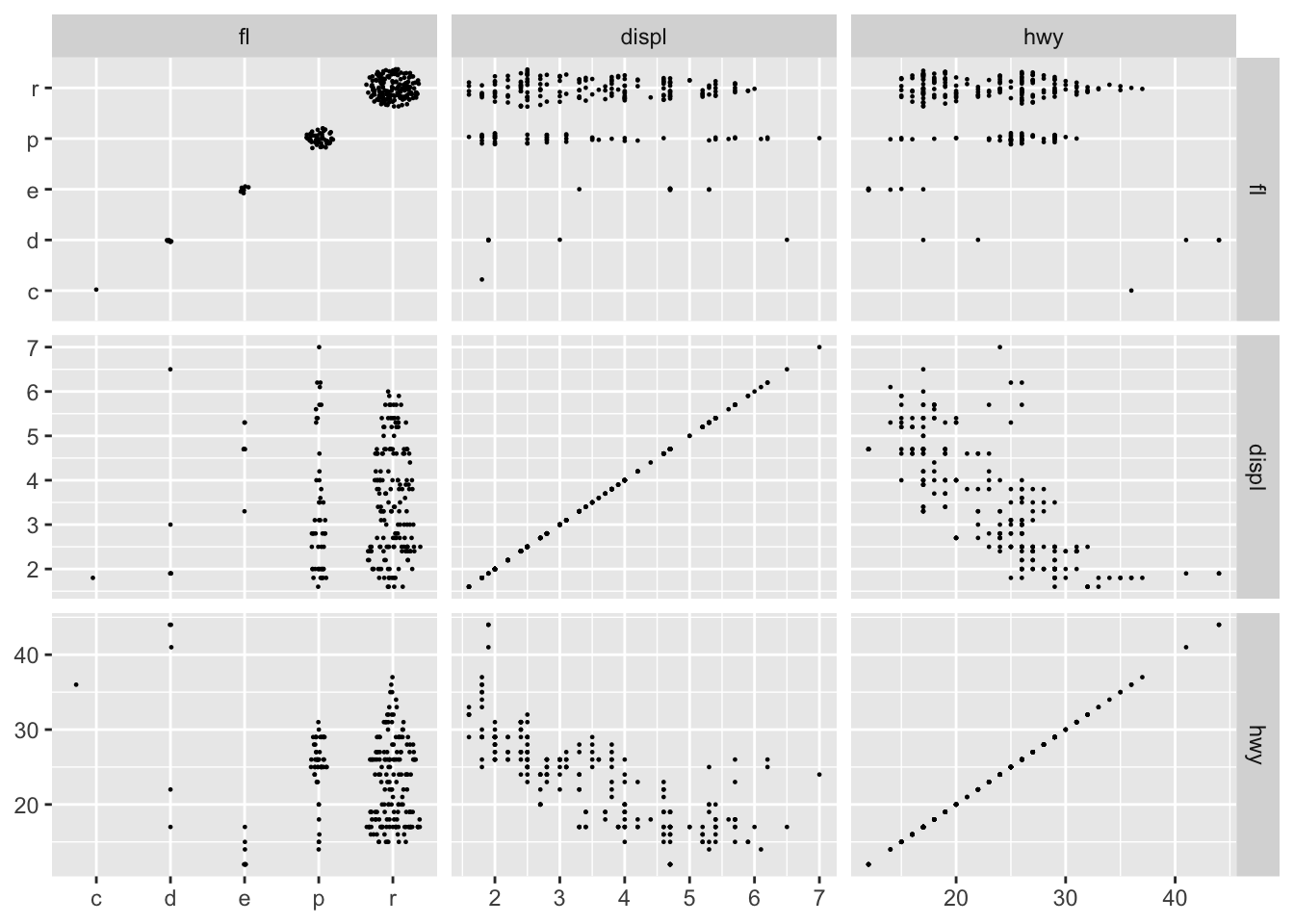
As we can see facet_matrix() itself handles the mix of scale types quite well, but geom_point() is not that telling when used on a mix of continuous and discrete position scales. ggforce handles this by providing a new position adjustment (position_auto()) that jitters the data based on the scale types. For continuous vs discrete it does a sina-like jitter, whereas for discrete vs discrete it jitters inside a disc (continuous vs continuous makes no jitter):
ggplot(mpg, aes(x = .panel_x, y = .panel_y)) +
  geom_point(shape = 16, size = 0.5, position = 'auto') +
  facet_matrix(vars(fl, displ, hwy))
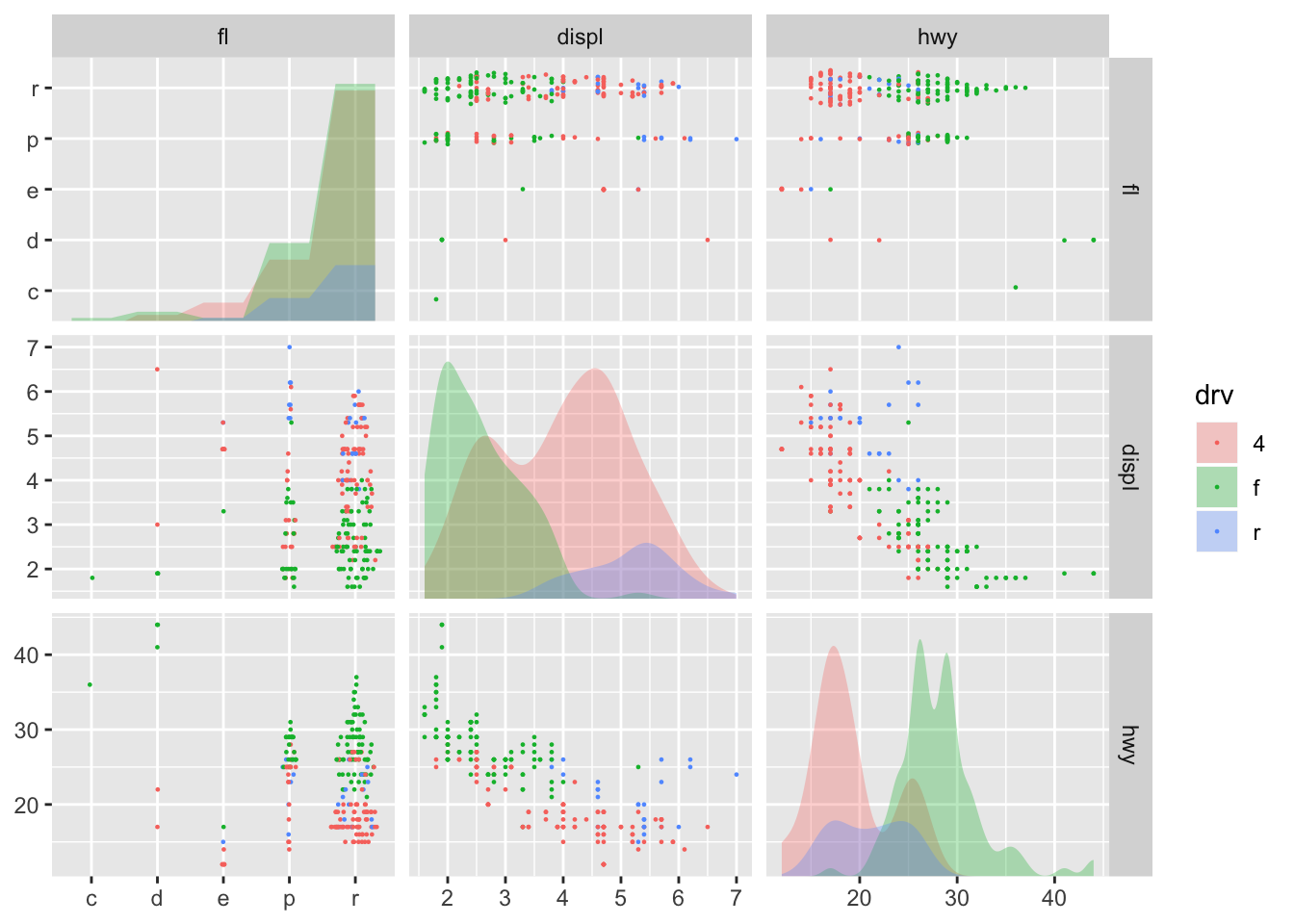
geom_autodensity() and geom_autohistogram() also knows how to handle both discrete and continuous data, so these can be used safely in all circumstances (here also showing that you can of course also map other aesthetics):
ggplot(mpg, aes(x = .panel_x, y = .panel_y, fill = drv, colour = drv)) +
  geom_point(shape = 16, size = 0.5, position = 'auto') +
  geom_autodensity(alpha = 0.3, colour = NA, position = 'identity') +
  facet_matrix(vars(fl, displ, hwy), layer.diag = 2)
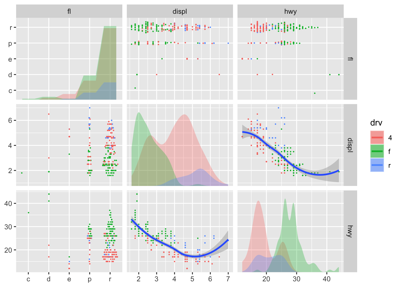
Lastly, if you need to use a geom that only makes sense with a specific combination of scales, you can pick these layers directly, though you may end up fiddling a bit to get all the right layers where you want them:
ggplot(mpg, aes(x = .panel_x, y = .panel_y, fill = drv, colour = drv)) +
  geom_point(shape = 16, size = 0.5, position = 'auto') +
  geom_autodensity(alpha = 0.3, colour = NA, position = 'identity') +
  geom_smooth(aes(colour = NULL, fill = NULL)) +
  facet_matrix(vars(fl, displ, hwy), layer.diag = 2, layer.continuous = TRUE,
               layer.mixed = -3, layer.discrete = -3)
The last example I’m going to show, is simply that you don’t have to create symmetric grids. By default facet_matrix() sets the column selection to be the same as the row selection, but you can overwrite that:
ggplot(mpg, aes(x = .panel_x, y = .panel_y)) +
  geom_point(shape = 16, size = 0.5, position = 'auto') +
  facet_matrix(vars(manufacturer, hwy), vars(drv, cty))
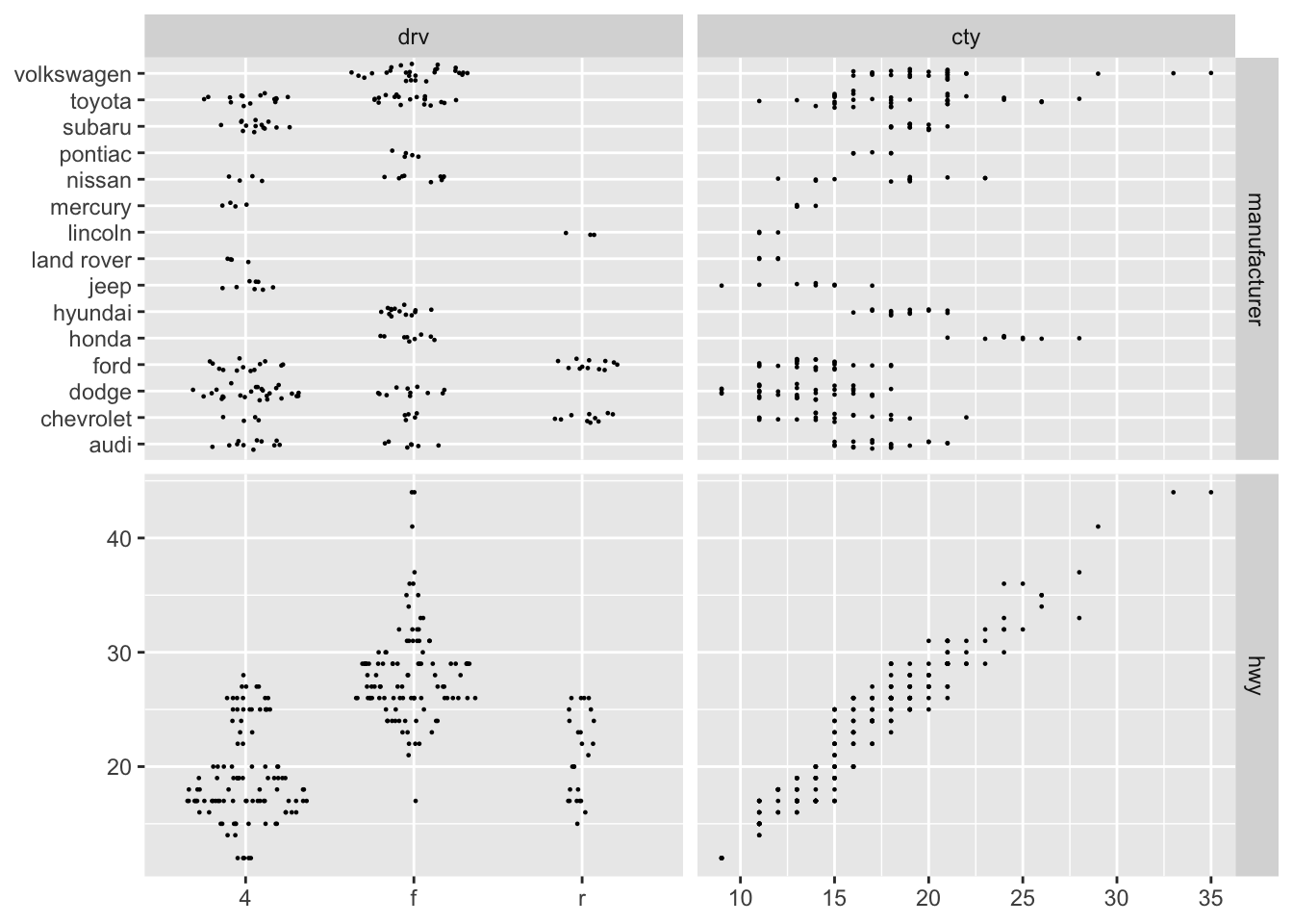
As you can hopefully appreciate, facet_matrix() is maximally flexible, while keeping the API of the standard use cases relatively clean. The lack of a ggplot2-like API for plotting different variables against each others in a grid has been a major annoyance for me, and I’m very pleased with how I finally solved it—I hope you’ll put it to good use as well.
Who needs two dimensions anyway?
The last new pack of facets are more benign, but something repeatedly requested. facet_row() and it’s cousin facet_col() are one-dimensional mixes of facet_grid() and facet_wrap(). They arrange the panels in a single row or single column respectively (like setting nrow or ncol to 1 in facet_wrap()), but by doing so allows the addition of a space argument as known from facet_grid(). In contrast to using facet_grid() with a single column or row, these new facets retain the facet_wrap() ability of having completely separate scale ranges as well as positioning the facet strip wherever you please:
ggplot(mpg) +
  geom_bar(aes(x = manufacturer)) +
  facet_col(~drv, scales = 'free_y', space = 'free', labeller = label_both) +
  coord_flip()
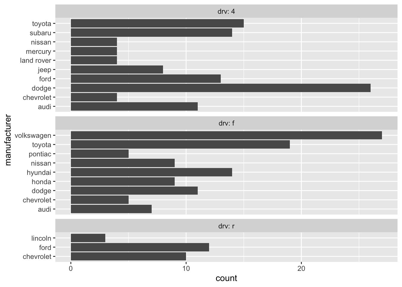
So, these were the flurry of facets I was going to bring you today—I hope you’ll put them to good use and create some awesome visualizations with them.
Next up: the next ggraph release!