This is my first blog post about gganimate — a package I’ve been working on since mid-spring this year. I have many thoughts and lots to say about animation and gganimate, so much in fact that it has seemed too big a task to begin writing about. Further, I felt like I had to spend my time developing the thing in the first place.
So this is an alternative entrance into writing about gganimate — sort of a tech-note about a specific problem. There will still come a time for some more formal writing about the theory and use of gganimate but until then I’ll refer to my useR keynote for any words on my thoughts behind it all.
The Problem
When we animate data visualisations we often do it by calculating intermediary data points resulting in a smooth transition between the states represented by the raw data. In gganimate this is done by adding a transition which defines how data should be expanded across the animation frames. Underneath it all most transitions calculate intermediary data representations using tweenr and transformr — so far, so good.
What we have glanced over, and what is at the center of the problem, is what state of the data we decide to use as basis for our expansion. If you are not familiar with ggplot2 and the grammar of graphics this might be a strange phrasing — data is data — but if you are, you’ll know that data can undergo several statistical transformations before it is encoded into a visual property and put on paper (or screen). Some of the states the data undergo are:
- Raw data as it is passed into the plotting function
- Raw data with only the columns mapped to aesthetics present
- Data transformed by a statistic
- Data with aesthetics mapped to a scale
- Data with default aesthetic values added
- Data transformed by the geom
If you prepare your data for animation beforehand (e.g. using tweenr), you’re only able to touch the data at the first state and thus limited in what you can do. If there is a one-to-one mapping between the raw data and the final visual encoding this might not be a problem, but it breaks down spectacularly when the statistic transformation impose a grouping of the data into a shared visual encoding, e.g. a box-plot. Consider the task of calculating intermediary data for a transition from one box-plot showing statistics for 10 points, to another box-plot showing statistics for 15 points. If you could only use the raw data your atomic observations would suddenly have to change from 10 to 15 values in a smooth manner. On the other hand, if you could calculate the statistics used to draw the two box-plots and then calculate intermediary statistics instead, this discrepancy in the underlying data would not pose any problem. Indeed, the latter approach is what is done in gganimate — all data expansion is performed after statistics have been calculated. In fact, all expansion is done when data has reached state 5. Why wait so long? A simple example to explain this is the case of colour (or fill) aesthetics. If they are mapped to a categorical variable there will be no way to create a smooth transition based on the raw data. On the other hand, if we wait until the raw data has been mapped to its final colour value, we may smoothly transition the colour itself, ignoring the fact that the intermediary colours does not correspond to any meaningful category in the raw data.
The Curious Case of Tesselation
So, “what is the problem?”, you may ask. Indeed, this approach is almost universally good, to the extend that you might just ignore the existence of other approaches… But the devils in the detail — let’s make a plot:
library(ggplot2)
library(ggforce)

data <- data.frame(
  x = runif(20),
  y = runif(20),
  state = rep(c('a', 'b'), 10)
)

ggplot(data, aes(x = x, y = y)) +
  geom_voronoi_tile(fill = 'grey', colour = 'black', bound = c(0, 1, 0, 1)) +
  geom_point() +
  facet_wrap(~state)
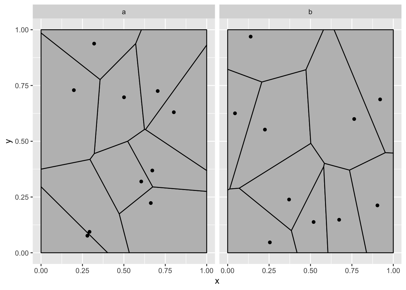
Now, think about what you would expect a transition between the two panels to look like - my guess is that it is nothing like below:
library(gganimate)
ggplot(data, aes(x = x, y = y)) +
  geom_voronoi_tile(fill = 'grey', colour = 'black', bound = c(0, 1, 0, 1)) +
  geom_point() +
  transition_states(state, transition_length = 3, state_length = 1) +
  ease_aes('cubic-in-out')
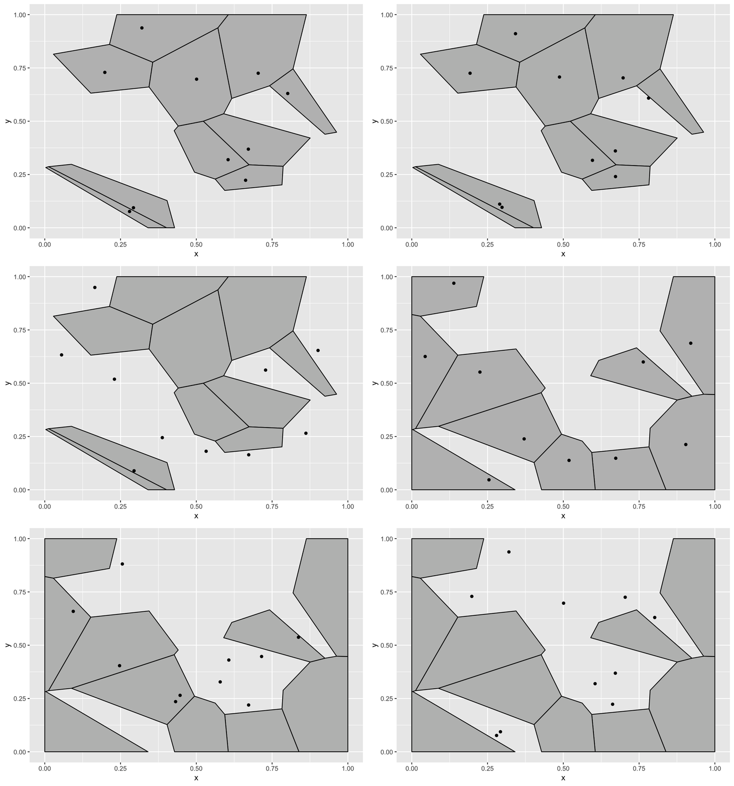
Okay, what is going on? To be honest I had a different expectation about how this would fail when I started writing this. The reason why the voronoi tiles are static (and calculated based on all the points) is that the voronoi tessellation is calculated on the full panel data. At the time the voronoi tile statistic receives the data it all just belongs to the same panel since gganimate differentiate states using the group aesthetics. To show you how I expected this example to break down we’ll have to tell the voronoi stat to tessellate based on the groups instead:
ggplot(data, aes(x = x, y = y)) +
  geom_voronoi_tile(fill = 'grey', colour = 'black', bound = c(0, 1, 0, 1),
                    by.group = TRUE) +
  geom_point() +
  transition_states(state, transition_length = 3, state_length = 1) +
  ease_aes('cubic-in-out')
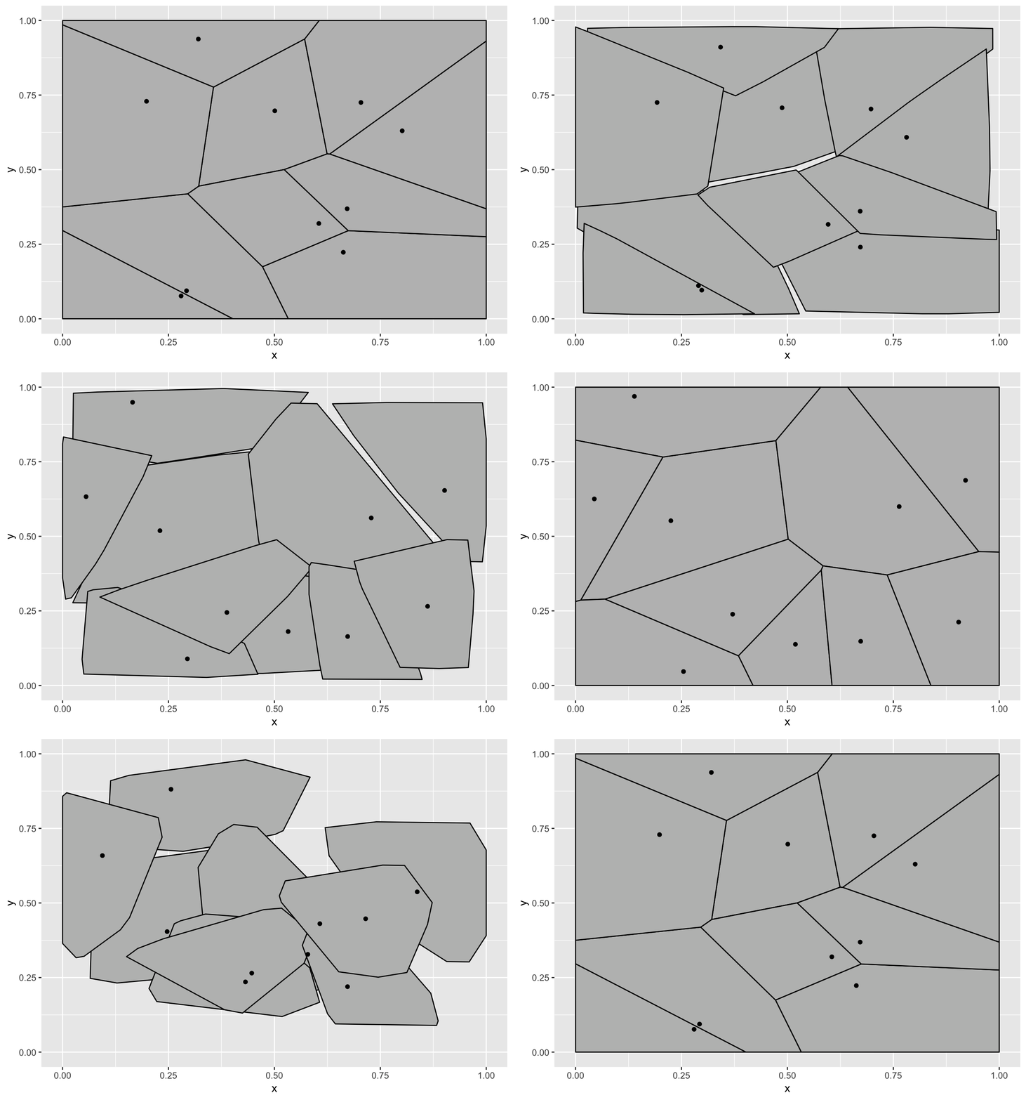
Now, at least it is wrong in the way that I expected it to be. Why is this wrong? The tessellation stat outputs polygon data that is then drawn by a polygon geom, so gganimate does the best it can to transition these polygons smoothly between the states. In this example this is not what we expected though. We expect a tessellation to always be true, even during the transition so the tessellation should be calculated for each frame, based on intermediary point positions. In other words, here we want the expansion to happen on the raw data.
library(tweenr)
library(magrittr)
data <- split(data, data$state)

data <- tween_state(data[[1]], data[[2]], 'cubic-in-out', 40) %>%
  keep_state(10) %>%
  tween_state(data[[1]],'cubic-in-out', 40) %>%
  keep_state(10)

ggplot(data, aes(x = x, y = y)) +
  geom_voronoi_tile(fill = 'grey', colour = 'black', bound = c(0, 1, 0, 1),
                    by.group = TRUE) +
  geom_point() +
  transition_manual(.frame)

Ah, we have finally arrived at the expected animation, but what a mess of a journey.
Who Plots Tesselation Anyway?
You may think the above example is laughably construed — this may even be the first time you’ve heard of voronoi tessellation. Hold my beer, because it is about to get even worse, even using a geom from ggplot2 itself. We’ll start with a plot again:
data <- data.frame(
  x = c(rnorm(50, mean = 5, sd = 3), rnorm(40, mean = 2, sd = 1)),
  y = c(rnorm(50, mean = -2, sd = 7), rnorm(40, mean = 6, sd = 4)),
  state = rep(c('a', 'b'), c(50, 40))
)

ggplot(data, aes(x = x, y = y)) +
  geom_contour(stat = 'density_2d') +
  facet_wrap(~state)
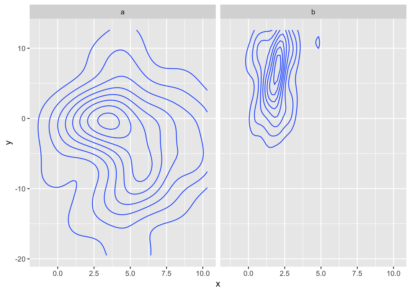
And how might this look if we transition between a and b?
ggplot(data, aes(x = x, y = y)) +
  geom_contour(stat = 'density_2d') +
  transition_states(state, transition_length = 3, state_length = 1) +
  ease_aes('cubic-in-out')
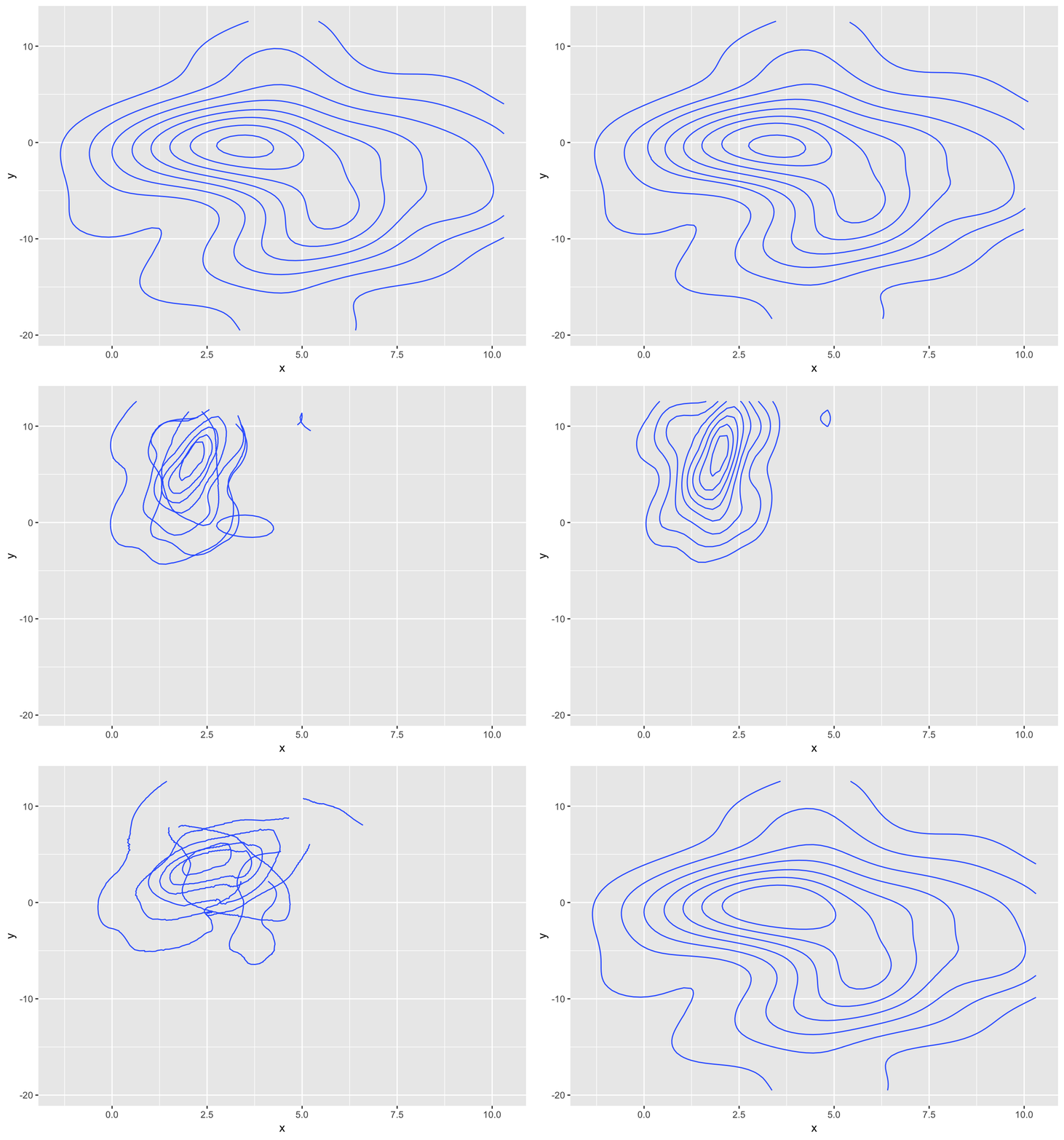
Oh my… The problem is more or less the same as with the tessellation - the stat creates a primitive data representation (here paths and not polygons) and gganimate does its best at transitioning those, but in doing this the intermediary frames does not resemble contour lines at all, but more a bowl of spaghetti.
So, could we fix it in the same way? Just prepare the data beforehand. Well, not really as we run into the first problem discussed, way up at the beginning of the blog. There is really no meaningful way of transitioning 50 points into 40. We could remove 10 and move the remaining 40, but in terms of the derived density this would look messy (but let’s try anyway):
data2 <- split(data, data$state)
data2 <- tween_state(data2[[1]], data2[[2]], 'cubic-in-out', 40) %>%
  keep_state(10) %>%
  tween_state(data2[[1]], 'cubic-in-out', 40) %>%
  keep_state(10)

ggplot(data2, aes(x = x, y = y)) +
  geom_contour(stat = 'density_2d') +
  transition_manual(.frame)
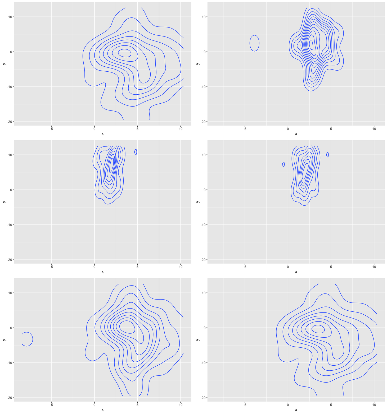
It sort of does the right thing, but there is a noticeable switch in the density as the 10 points disappears and reappears.
What we really want to do is to calculate intermediary states of the 2D densities that the contours are derived from. The densities remove the point discrepancy while presenting a statistic that can be truthfully transitioned. Unfortunately the density data is only present ephemerally inside the stat function and is not accessible to the outside world (where gganimate resides). We could rewrite the density_2d stat to wait with the contour transformation:
StatDensityContour <- ggproto('StatDensityContour', StatDensity2d,
  compute_group = function (data, scales, na.rm = FALSE, h = NULL, contour = TRUE,
                            n = 100, bins = NULL, binwidth = NULL) {
    StatDensity2d$compute_group(data, scales, na.rm = na.rm, h = h, contour = FALSE,
                                n = n, bins = bins, binwidth = binwidth)
  },
  finish_layer = function(self, data, params) {
    names(data)[names(data) == 'density'] <- 'z'
    do.call(rbind, lapply(split(data, data$PANEL), function(d) {
      StatContour$compute_panel(d, scales = NULL, bins = params$bins,
                                binwidth = params$binwidth)
    }))
  }
)

ggplot(data, aes(x = x, y = y)) +
  geom_contour(stat = 'density_contour') +
  transition_states(state, transition_length = 3, state_length = 1) +
  ease_aes('cubic-in-out')

What to make of this?
You might feel like Alice who has stepped through the looking glass at this point. Should you always second guess whatever gganimate is doing? Of course not. The choice of interpolating the statistically transformed data is sound and will just work for most of what you want to do. I certainly want to allow gganimate to expand based on the raw data as well, though this has proven harder than expected as it is often only a subset of aesthetics you want to expand at that state (remember the problem with unmapped colour/fill).
Even if early expansion gets implemented it will only solve problems such as the voronoi example. The last contour example runs deeper and touches upon the theory of the grammar of graphics and how ggplot2 implements it itself. Statistical transformations are often envisioned as a single operation, but can just as well be thought of as a chain of transformation (here density_2d -> contour). Alternatively one could think that it was the responsibility of the geom to calculate the contour lines. All-in-all the dichotomy of stat+geom is not so clear cut as it might appear, which has not been much of a problem when generating static plots. With the advent of gganimate this problem becomes more pertinent and I honestly don’t know the best way to address it. In a perfect world, all stats would return the data-state best fitted for expansion but this would require the finish_layer() hook to be more powerful, and would obviously require rewrites of a slew of geoms/stats. Then comes the question of whether it is even the responsibility of geom/stat developers to consider gganimate in the first place…
No matter the eventual solution to all this, I hope this post has made you a bit more aware of what happens to the data you plot as you passed it into ggplot2. Visualisations are after all first and foremost about data transformations…