Scico and the Colour Conundrum

I’m happy to once again announce the release of a package. This time it happens to be a rather unplanned and quick new package, which is fun for a change. The package in question is scico which provides access to the colour palettes developed by Fabio Crameri as well as scale functions for ggplot2 so they can be used there. As there is not a lot to talk about in such a simple package I’ll also spend some time discussing why choice of colour is important beyond aesthtic considerations, and discuss how the quality of a palette might be assesed.
An overview of the package
scico provides a total of 17 different continuous palettes, all of which are available with the scico() function. For anyone having used viridis() the scico() API is very familiar:
library(scico)
scico(15, palette = 'oslo')
## [1] "#000000" "#09131E" "#0C2236" "#133352" "#19456F" "#24588E" "#3569AC"
## [8] "#4D7CC6" "#668CCB" "#7C99CA" "#94A8C9" "#ABB6C7" "#C4C7CC" "#E1E1E1"
## [15] "#FFFFFF"
In order to get a quick overview of all the available palettes use the scico_palette_show() function:
scico_palette_show()
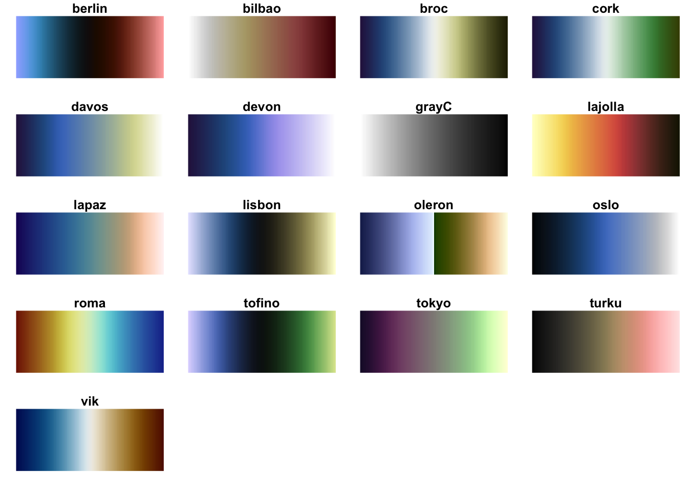
As can be seen, the collection consists of both sequential and diverging palettes, both of which have their own uses depending on the data you want to show. A special mention goes to the oleron palette which is intended for topographical height data in order to produce the well known atlas look. Be sure to center this palette around 0 or else you will end up with very misleading maps.
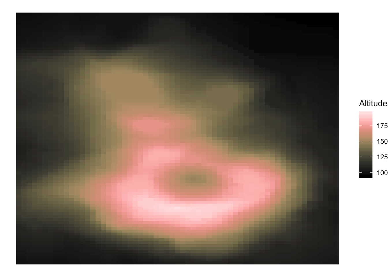
ggplot2 support is provided with the scale_[colour|color|fill]_scico() functions, which works as expected:
library(ggplot2)
volcano <- data.frame(
  x = rep(seq_len(ncol(volcano)), each = nrow(volcano)),
  y = rep(seq_len(nrow(volcano)), ncol(volcano)),
  Altitude = as.vector(volcano)
)

ggplot(volcano, aes(x = x, y = y, fill = Altitude)) +
  geom_raster() +
  theme_void() +
  scale_fill_scico(palette = 'turku')
This is more or less all there is for this package… Now, let’s get to the meat of the discussion.
What’s in a colour?
If you’ve ever wondered why we are not all just using rainbow colours in our plots (after all, rainbows are pretty…) it’s because our choice of colour scale have a deep impact on what changes in the underlying data our eyes can percieve. The rainbow colour scale is still very common and notoriously bad - see e.g. Borland & Taylor (2007), The Rainbow Colour Map (repeatedly) considered harmful, and How The Rainbow Color Map Misleads - due to two huge problems that are fundamental to designing good colour scales: Perceptual Uniformity and Colour Blind Safe. Both of these issues have been taken into account when designing the scico palettes, but let’s tackle them one by one:
Colour blindness
Up to 10% of north european males have the most common type of colour blindness (deuteranomaly, also known as red-green colour blindness), while the number is lower for other population groups. In addition, other, rarer, types of colour blindness exists as well. In any case, the chance that a person with a color vision deficiency will look at your plots is pretty high.
As we have to assume that the plots we produce will be looked at by people with color vision deficiency, we must make sure that the colours we use to encode data can be clearly read by them (ornamental colours are less important as they - hopefully - don’t impact the conclusion of the graphic). Thanksfully there are ways to simulate how colours are percieved by people with various types of colour blindness. Let’s look at the rainbow colour map:
library(pals)

pal.safe(rainbow, main = 'Rainbow scale')
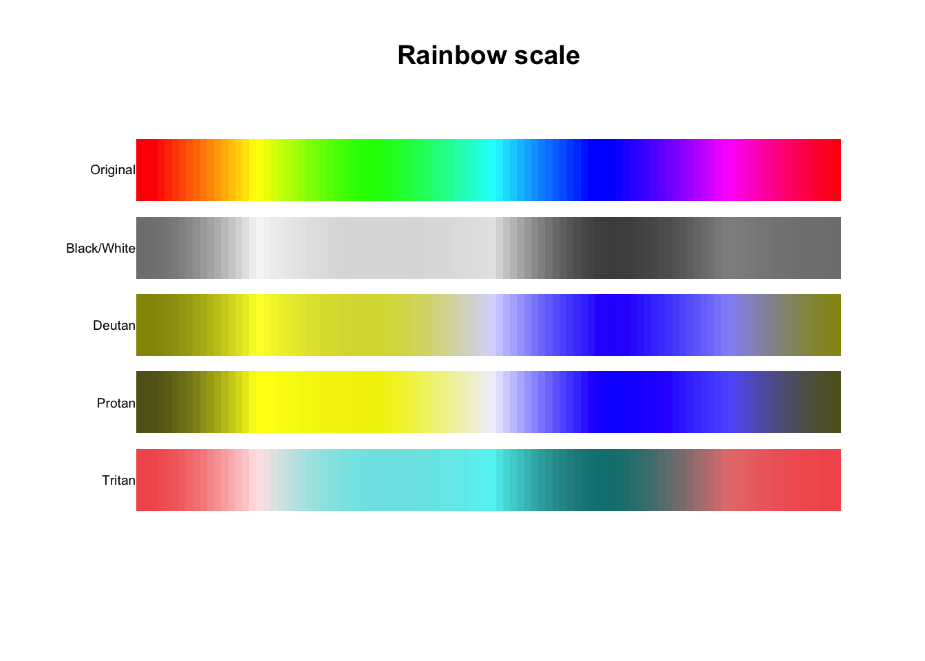
As can be seen, there are huge areas of the scale where key tints disappears, making it impossible to correctly map colours back to their original data values. Put this in contrast to one of the scico palettes:
pal.safe(scico(100, palette = 'tokyo'), main = 'Tokyo scale')
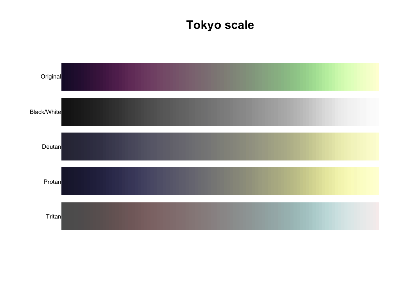
While colour blindness certainly have an effect here, it is less detrimental as changes along the scale can still be percieved and the same tint is not occuring at multiple places.
Perceptual uniformity
While lack of colour blind safety “only” affects a subgroup of your audience, lack of perceptual uniformity affects everyone - even you. Behind the slightly highbrow name lies the criteria that equal jumps in the underlying data should result in equal jumps in percieved colour difference. Said in another way, every step along the palette should be percieved as giving the same amount of difference in colour.
One way to assess perceptual uniformity is by looking at small oscillations inside the scale. Let’s return to our favourite worst rainbow scale:
pal.sineramp(rainbow, main = 'Rainbow scale')
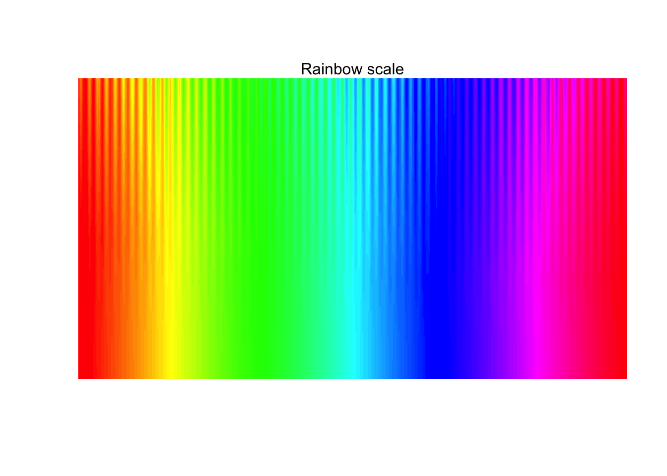
We can see that there are huge differences in how clearly the oscilations appear along the scale and around the green area they even disappears. In comparison the scico palettes produces much more even resuls:
pal.sineramp(scico(100, palette = 'tokyo'), main = 'Tokyo scale')
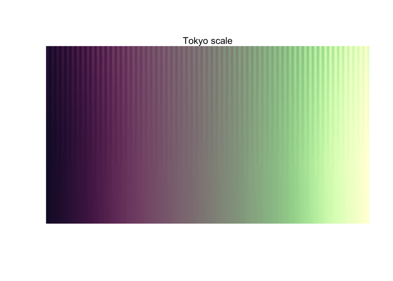
But wait - there’s more!
This is just a very short overview into the world of colour perception and how it affects information visualisation. The pals package contains more functions to assess the quality of colour palettes, some of which has been collected in an ensemble function:
pal.test(scico(100, palette = 'broc'), main = 'Broc scale')
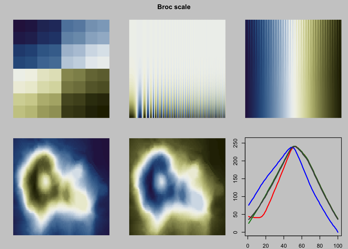
It also has a vignette that explains in more detail how the different plots can be used to look into different aspects of the palette.
scico is also not the only package that provides well-designed, safe, colour palettes. RColorBrewer has been a beloved utility for a long time, as well as the more recent viridis. Still, choice is good and using the same palettes for prolonged time can make them seem old and boring, so the more the merrier.
A last honerable mention is the overview of palettes in R that Emil Hvitfeldt has put together. Not all of the palettes in it (the lions share actually) have been designed with the issues discussed above in mind, but sometimes thats OK - at least you now know how to assess the impact of your choice and weigh it out with the other considerations you have.
Always be weary of colours