Announcing ggraph: A grammar of graphics for relational data
I am absolutely thrilled to announce that ggraph has finally been released on CRAN. ggraph is my most ambitious package to date and its very early genesis has been described in a prior post. If any mention of ggraph is completely new to you, then in short terms ggraph is an extension of the ggplot2 API to support relational data such as networks and trees. I feel fairly confident in saying that ggraph is the most powerful way to create static network based visualizations in R. Leading up to the release, the three main concepts of ggraph has been described in detail in their own blog posts (layouts, nodes, and edges) so this will not be reiterated here. Instead I’ll talk a bit about the philosophy behind the package as well as show of some of the features that do not fall into any of the three main concepts.
The Philosophy
There is no shortage of software for creating network visualizations and there is no shortage of said visualizations themselves. Often though, the visualizations are more impressive than informative and it is easy to feel that their main task is to show that we are really dealing with some complex data. All of this has led to a certain disdain for classic network visualizations perfectly encapsulated in the nickname hairballs. It does not have to be like this! The greatness of ggplot2 lies in how it allows users to quickly iterate over visualization approaches, thus better ensuring that the best visualization approach is reached. If this was extended to relational data it is my belief that users would be more likely to try to make plots that are more meaningful. After all we all want interpretability, right? Consider having to try out 7 different network visualization packages with different APIs versus just mixing and matching layouts and geoms in an iterative process — I know which way I prefer.
The goal of ggraph is thus clear — provide everything related to visualizations of relational data in a ggplot2-like API to lessen the cognitive load on experimenting with different visual representations. I’m not there yet, but I feel the current version represents a solid foundation where most users will not feel many limitations — on the contrary I believe most users will feel like the chains have come off and they are set free.
Future focus
As I pointed out, ggraph is far from done. I’ll try to keep my development focus in the open by putting things on the road-map as GitHub issues. Honorable mentions include matrix, d3-force and sankey layout, expanded support for edge endings (more choices than grid::arrow() provides), edge routing (avoid node collision), and textbox nodes. I welcome all suggestions as the world of network visualizations is moving fast and I cannot keep on top of everything.
Features besides layouts, nodes, and edges
Understanding the node and edge geoms along with how layouts are defined will get you a long way towards visualizing networks. Still, ggraph has more to offer, some of which will be discussed here:
theme_graph()
Consider the following plot:
library(ggraph)
library(igraph)
graph <- graph_from_data_frame(highschool)

p <- ggraph(graph, layout = 'kk') +
    geom_edge_link(aes(colour = factor(year))) +
    geom_node_point() +
    ggtitle('An example')

p
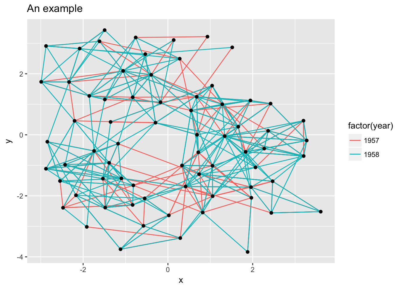
While the ggplot2 heritage clearly shows due to the grey background with white grid lines, the whole concept of x and y axes is often redundant in network visualizations and are just a distraction. ggraph provides its own theme optimized for network visualizations called theme_graph(), that facilitates clean and beautiful visualizations:
p + theme_graph()
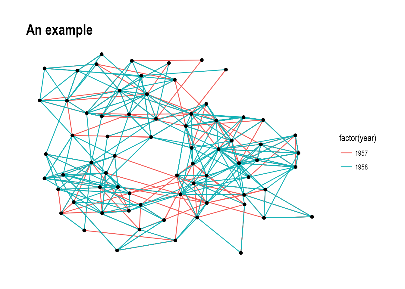
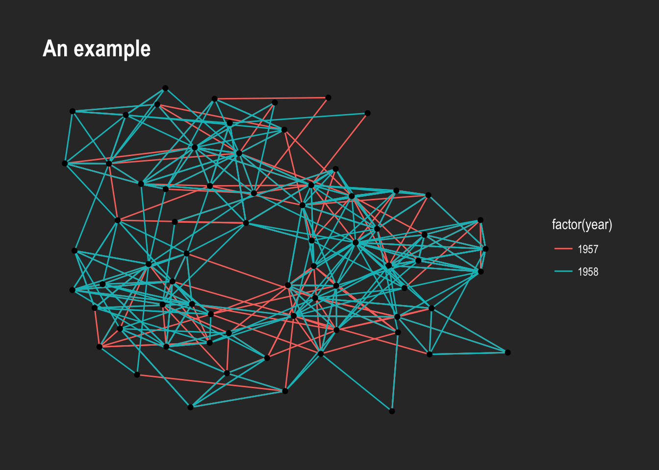
theme_graph(), besides removing axes, grids, and border, changes the font to Arial Narrow (this can be overridden). Furthermore, it makes it easy to change the coloring of the plot:
p + theme_graph(background = 'grey20', text_colour = 'white')
Adding the same theme to every plot is tedious and ggraph provides a way to avoid this. Using set_graph_style() the theme_graph() is set as default. As an extra benefit all text-based geoms gets their defaults updated so the text automatically uses the same style as the theme.
set_graph_style()

p

Facetting
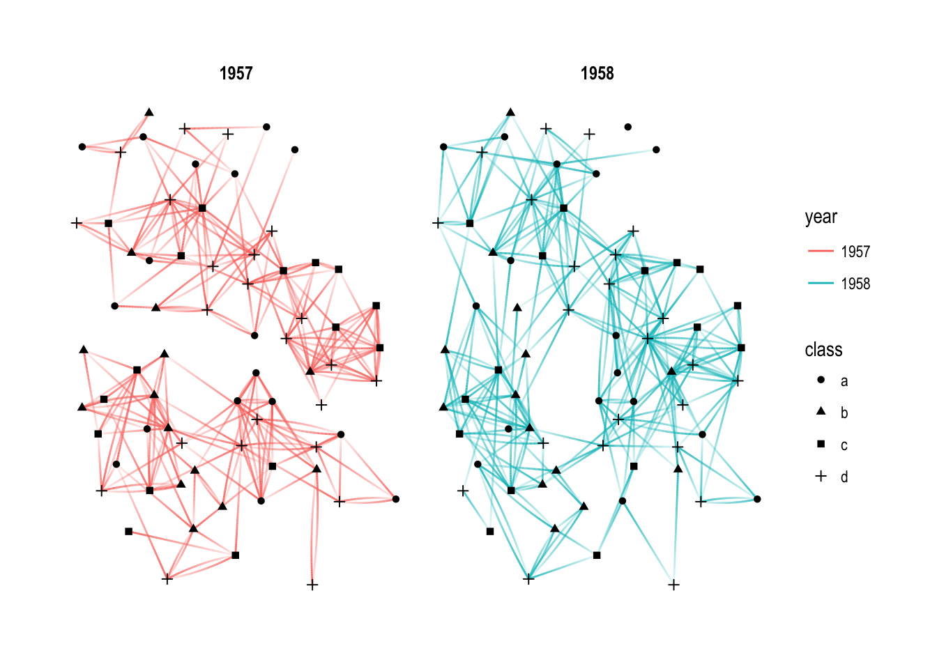
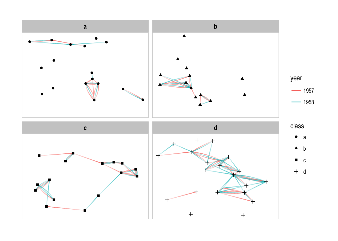
A powerful but underutilized way of gaining insight into networks is by using small multiples. This technique can reduce edge over-plotting in a very meaningful way by spreading nodes and edges out based on their attributes. The benefits of small multiples are not unique to relational data, as the popularity of ggplot2s facetting functionality shows. The base facetting functions provided by ggplot2 is a bad fit for networks though, as we are working with two very distinct types of data. If you facet on a node attribute, all edges would be plotted in all panels, despite the terminal nodes not being present which is not what you expect. Because of this ggraph comes with its own set of facetting functions tailored to network data:
facet_nodes() and facet_edges()
These two functions are equivalent to facet_wrap() in functionality, but they only address node and edge data respectively. When using facet_nodes() edges are only drawn in a panel if both terminal nodes are present there. When using facet_edges() nodes are always drawn in all panels even if the node data contains an attribute named the same as the one used for the edge facetting.
# Assign each node to a random class
V(graph)$class <- sample(letters[1:4], gorder(graph), TRUE)
# Make year a character
E(graph)$year <- as.character(E(graph)$year)

p <- ggraph(graph, layout = 'kk') +
    geom_edge_fan(aes(alpha = ..index.., colour = year)) +
    geom_node_point(aes(shape = class)) +
    scale_edge_alpha(guide = 'none')

p + facet_edges(~year)
Often, when working with small multiples it is nice to have some visual separation between each plot — setting a foreground color in theme_graph() will add strip background and border (you can also use the th_foreground() helper for this):
p + facet_nodes(~class) + th_foreground(foreground = 'grey80', border = TRUE)
# Lets not have to add this everytime
set_graph_style(foreground = 'grey80')
facet_graph
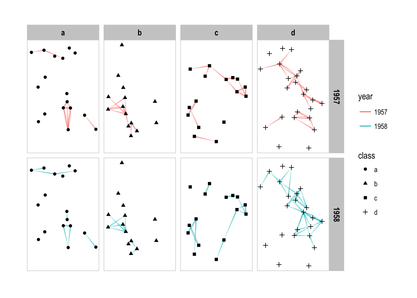
Facetting on two variables simultaneously is very powerful and something that is supported in ggplot2 with facet_grid(). In ggraph the same is possible using facet_graph() that takes the behavior of facet_nodes() and facet_edges() and combines them:
p + facet_graph(year ~ class)
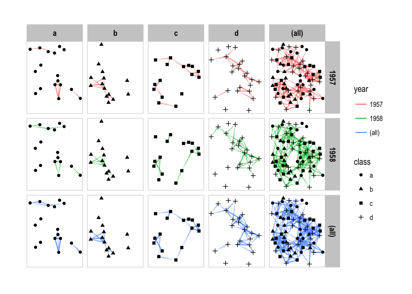
As with facet_grid() marginal plots are supported as well:
p + facet_graph(year ~ class, margins = TRUE)
While the default is to put facet the rows on edges and the columns on nodes, this is free to change using the row_type and col_type arguments. There is nothing stopping you from facetting on the same type in each dimension either:
# Facet edge by the class of their start node as well as year
p + facet_graph(year ~ node1.class, col_type = 'edge')
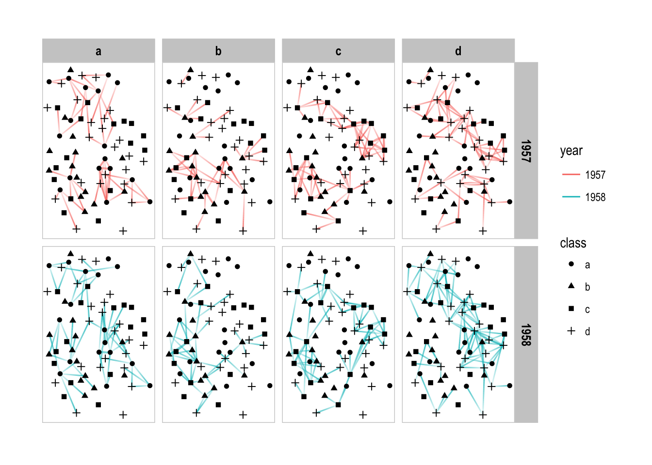
I hope I have convinced you that facetting in the context of relational data is both very easy, as well as extremely powerful. Avoiding the hairball is one of the prime goal of network visualizations and using small multiples is a fantastic way of cutting down on the number of nodes and edges while still getting the full picture.